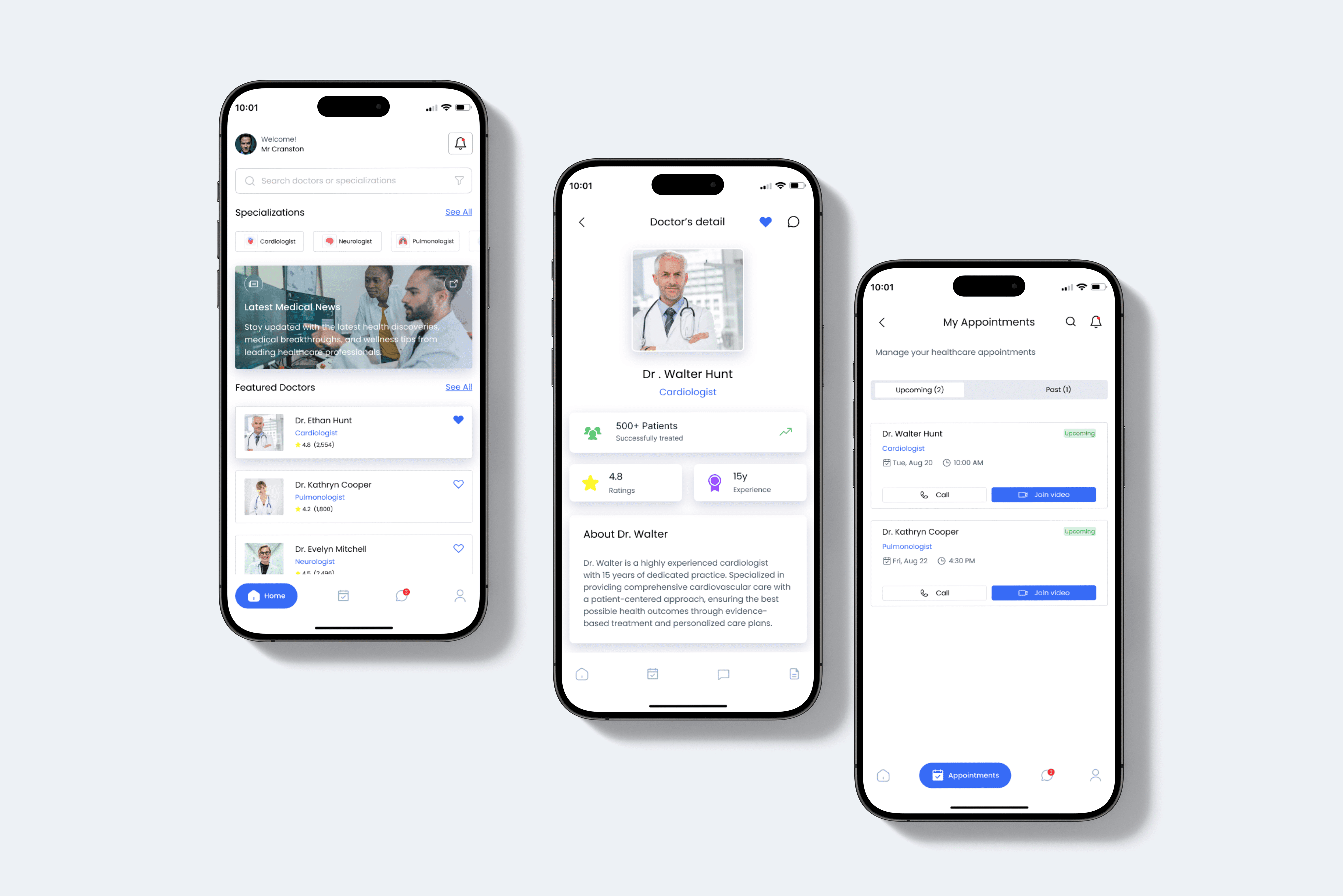
DocOn: Doctor Appointment Booking App
DocOn is an app for booking doctor's appointments, enabling users to schedule appointments from anywhere.
Role
UX/UI Designer
Industry
Healthcare Technology
Duration
1 month
Stage 1. User Research
To start the project, I first tried to understand how people book doctor appointments and what problems they face. I looked into how users search for doctors, check their profiles, and manage appointments. To get a better idea of industry standards, I reviewed several medical and doctor-booking apps through Google, Behance, and Play Store/App Store listings.
I also used AI tools to gather additional insights on common user expectations and best practices in healthcare UX. This helped me identify the core needs: easy doctor discovery, clear appointment details, smooth communication, and simple profile management. These findings gave me a solid direction before moving ahead with concepts and layouts.
Stage 2.Design Ideation & Concept Development
After completing my research, I began shaping the concept of the app by exploring how to make the doctor-booking process as simple and stress-free as possible. I sketched different layout ideas for the home screen, doctor profiles, and appointment flow, while also studying existing medical apps to understand what works well. Based on these observations, I planned a clear structure that allows users to easily search doctors, view important details, manage appointments, and receive updates without confusion. This stage helped me define the visual direction, main screens, and the overall flow before moving into wireframing and detailed UI design.
Stage 3. Design Execution
Wireframing: In this step, I turned my ideas into simple low-fidelity layouts to define the structure of each screen. The goal was to focus only on layout, flow, and user actions without worrying about colors or styling. This helped me make quick adjustments and ensure that the main features—doctor search, doctor details, appointments, and messages—were placed in a logical and easy-to-use way.
Prototyping: After finalizing the wireframes, I connected the screens to create an interactive prototype. This allowed me to test the navigation flow, appointment booking steps, and overall usability. For the prototype, I included the important screens like Home, Doctor’s Profile, Appointment Management, and Messages so I could see how users would move through the app in real time.
User Interface Design: Once the flow felt right, I started working on the final visual design. I added clean layouts, soft colors, readable typography, and a calm blue accent theme to make the app look professional and trustworthy. I refined every component, from the doctor cards to appointment buttons, to make the experience smooth and consistent. I did not use a dark theme in this app, as my focus was on keeping the UI light, modern, and easy for all users.


Stage 4. User Testing & Iterations
To validate my design decisions, I shared the prototype with real users on Reddit and LinkedIn to gather honest, unbiased feedback. Users pointed out small issues in navigation flow, appointment steps, and the visibility of key actions. Based on their suggestions, I refined the layout, improved button clarity, and streamlined the booking process to make the app faster and easier to use. These quick iterations helped shape a smoother, more reliable user experience.
Stage 5. Final Presentation and Documentation
I organized all screens, workflows, and design decisions into a structured presentation to clearly communicate the app’s purpose and functionality. I also documented the user research, ideation, design process, and iterations in a polished case study format. This helped present DocOn as a complete, user-focused solution for effortless doctor appointment booking.


Outcomes
The final DocOn app offers a smooth and intuitive doctor-booking experience, making it easy for users to find doctors, check availability, and schedule appointments. Feedback from Reddit and LinkedIn highlighted the clean flow and clarity of the design. Throughout this project, I learned how to simplify complex healthcare journeys, improve decision-making for users, and refine my designs based on real user feedback.
Other projects
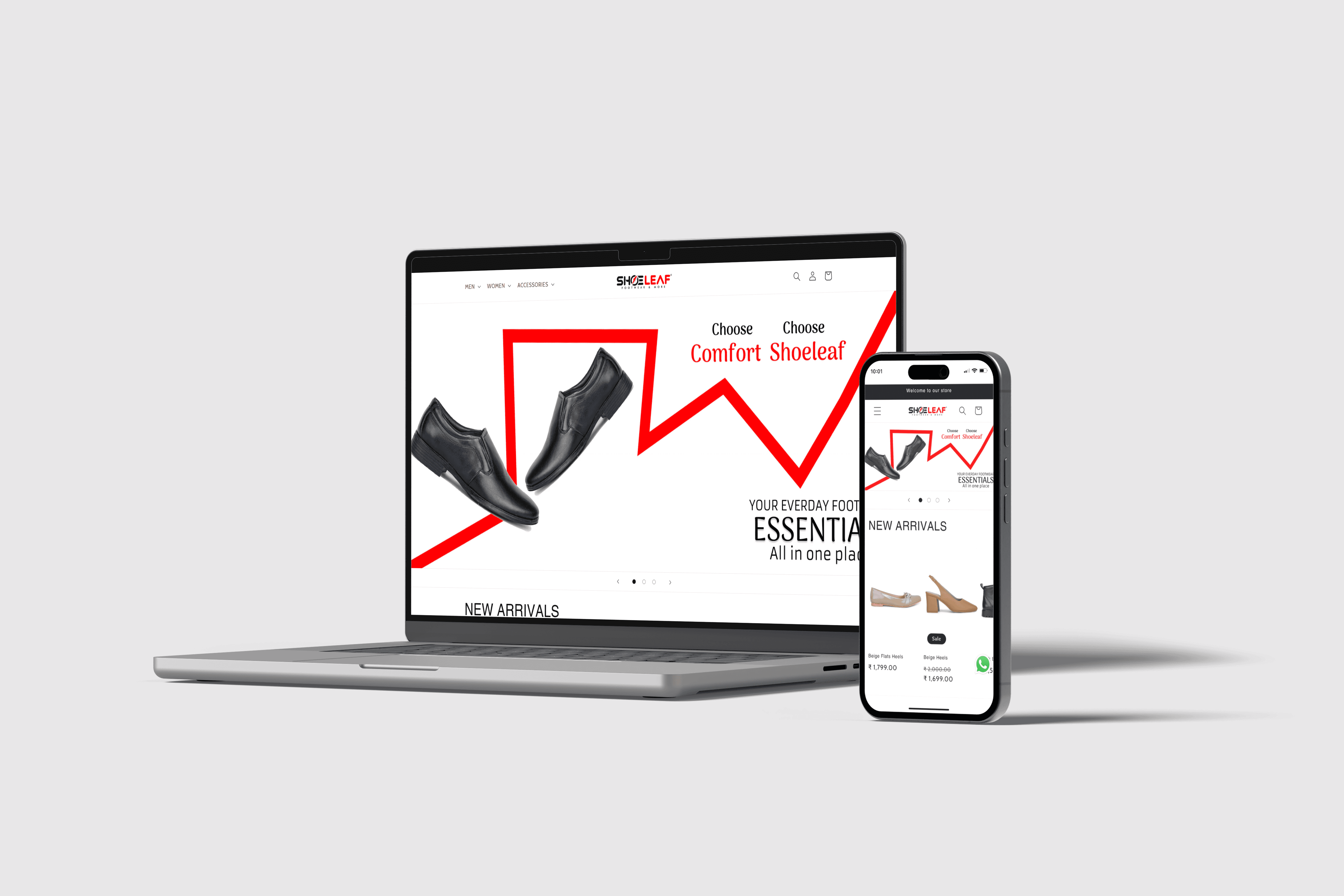
Internship Project: Shoeleaf Website Design
Designed an e-commerce website for Shoeleaf, streamlining the online footwear shopping experience from concept to interactive prototype.

TradeWise: Modern App for Market Insights and Investments
Designing a modern stock trading app focused on helping users track market trends, manage their portfolio, and make informed investment decisions with an intuitive interface and clean visuals.